Tuesday 23 November 2010

Production & Outcomes

What are the platforms that Illustrations use to affect the communication?


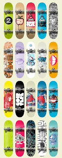
Here are some examples of the work of Jared Nickerson (J3 Concepts).


The way that J3 Concepts has crossed a variety of platforms is really cleaver and suits his style, which often consists of repeating patterns. There are a lot of different ways that he has put his work out there aimed at young trendy geeky gadget loving skateboarding design conscious persons.

There seems to be a glimpse at an undercurrent of a hint towards a cool retro subculture in a lot of j3’s work. Taking subtle yet iconic images and jumbling them up in to a pastiche of subdued and at the same time vibrantly colourful art works.


The use of retro cool items in his work will draw the attention of niche consumers to his collection of work and the fact that it is digital art means that its relatively simple to recreate the art work on to any format or platform. The message that he is selling to the viewer is to buy in to the unique blend of stylised iconography to enhance your life style. If you like his style then some of the cool stylish uniqueness will reflect upon you.


What is the importance of understanding ones own design process?

When producing artwork it is important to follow a design process to create a interesting and intelligent solution that fits the brief.  

My process starts with trying be be aware of what is going on in the design world, what is trendy and now, and having the ability to draw influences from my environment and collect visual information which I can then use.  

It is important to start by understanding the brief and the clients objectives in order that the end product is appropriate .  Once I am clear with the brief I then do research and come up with some initial ideas, which once discussed can be developed.  I consider my target audience, my intended message, imagery and choice of media.  I have learnt to find a natural stopping point so I don't carry on researching and developing ideas for ever.   

This is an example of my work explaining the process I followed:

The brief; re-brand this logo for thisisgreenliverpool.com


There was no other information given so the first thing that was done was to speak to the client and bounce some ideas off their team. I then received an email with some images that they found interesting and thought that I might be able to work from. I also did my own research split in to two categories, firstly working from the images that they sent and then working from my own ideas. 


I also made sketches and mind mapped ideas with the intention of emailing them to the client to make sure that we were on the same wavelength. After getting some positive feed back and agreeing on the direction they wanted to follow I then moved onto some mock-ups to get ideas for colour and fonts. 


I sent the client a number of different designs and colour mock-ups and made adjustments to there specifications. The finished image was agreed upon and the design was sent to the client in their chosen file type.


By communicating with the client and critically appraising my own ideas and listening to their feedback I was able to create a logo that the client was pleased with.



Monday 22 November 2010

Identify a three-act structure in a recent film and Character design

I’m a Cyborg but that’s Ok.
Act1
There’s a girl and she works in a factory making radios or something, all appears very normal. It becomes evident that she is suffering from a delusional fantasy in which she is a cyborg (a robot that looks like a human). This delusion nearly kills her when she plugs herself into the mains power in an attempt to recharge her batteries. She then gets sent to a mental health hospital because she’s the only one who thinks she’s a cyborg and is unable to convince any one else. 


Act2
In the mental hospital she refuses to eat food and tries to gain sustenance from AA batteries by holding them in between her fingers and also licking them, nice. She continues to refuses to eat and thus become more and more dilapidated. She then meets this bloke in the mental hospital. They become friends and he likes her so tries to help her by pretending to invent a device that converts food into stuff cyborg’s can live off. So she starts eating food again and starts to recover.

She also has a fantasy/hallucination where she starts shooting and killing the doctors with heavy-duty firepower coming from her fingertips, cool. 

Act 3
The girl is still delusional and has a dream where she discovers that she is really a bomb and to fulfil her goal she needs to be struck by lighting and blow up. The bloke pretends to help her because he fancies her but intends to save her from herself by sabotaging her attempts to be struck by lighting. Her plan is to go to the top of a hill in the middle of a storm and basically get struck by lightning. Anyway her plan fails with some help from the bloke and they fall in love and live happily ever after.


Character design

Ash Williams from Evil Dead 2
What does the character look like? 

Ash Williams, our protagonist, has the look of a crazed demon killing, chainsaw wielding average Joe. His clothing is torn and blood soaked, his face is cut and twisted with fear and determination. He has one hand missing (because he had to cut it off) and he has to protect a woman from a demon.

What does the character do?

Through out the film Ash mainly has to fight for his life, using only a shotgun and a chainsaw he faces demons and the like in a battle for his soul. The ensuing battle can only be won by reciting from the pages of the Necronomicon (book of the dead) that Ash has to find.

How does the character relate to the other characters and to events in the story?

Ash is an unlikely hero and is forced in to some difficult situations as the events of the story play out. He has to decapitate his girlfriend after she killed and subsequently possessed by a demon. He also get possessed by a demon and cuts his own hand off and beats up on the other characters in the film.


 Reference


Tuesday 9 November 2010

Drawing and utilise your creative brain


These images are from the sketchbook of James Jean. They represent good examples of the principals: Drawing and Utilising your creative brain.

The intention of the images above is to help to develop and document ideas, to be a resource for future reference so the things that catch the eye in that moment can become inspiration for things that haven’t necessarily been thought of yet. Also to enhance and maintain the skill of being able to draw, if one doesn’t draw for a while it can take time to regain the ability.

The images are very effective as a resource and also show a really high level of skill and a good ability to observe and depict the subject.

It’s hard to define the audience for a sketchbook because its not the finished article. That leads to the thinking that the primary audience would be the creator of the sketchbook, the point of the sketchbook being to formulate and develop future ideas.

Also the fact that the sketchbooks are included on James Jean’s website show that there is a wider audience who appreciate and value the sketchbooks as separate works of art, but also intrinsically vital to the whole.

The signs in the images are references to the cultural context that the artist is viewing. Things such as airports, film sets, car badges, baseball cards and the people all suggest travelling and a collection of thing from popular American culture. The footnotes under the images on his website indicate where some of the sketches were drawn.

Sketchbooks are often quite personal and could be considered to be a messages or visual notes to the creator of the sketchbook, the context of the sketches depict images of every day life draw overlapping each other using pencil and ink to create strong lines and intense detailing.

This is a quote from illustrator Tin Salamunic.

“I never fully believed in such things as talent. Many see it as some sort of ‘gift‘, or special natural ability to do things without much effort. But many are not aware of the history of hard work most artists carry behind their art. Creativity and great conceptual thinking are not the result of having talent. They are the result of all the artist’s studies and pieces of their visual library in their head forming new images and ideas.
People are always searching for the best way to develop their own personal style or voice in art. The best way to do this is to constantly record images in your sketchbook, draw everything in front of you, keep a visual diary. Draw so much it becomes intuitive, natural, like your handwriting.”

References 


Thursday 28 October 2010

Legibility and Tone of Voice.


This advertising billboard was designed by the McFaul studio. The project information on there website reads;

 “With the new fuel efficient Audi A6 you can drive a further 107 miles per tank. BBH wanted something playful and crafted that gives you the impression there is a lot of stuff to be seen with the extra mileage.”

The intention seems to be to inform passing motorists about the economic and environmental benefits of owning an Audi A6.

The intricately illustrated typeface is used to convey the idea of travelling and looks like twisting roads. After sitting here and studying it for a while it certainly looks very stylish. But if I were driving past this advertising billboard I would find it very difficult to read.

Being an advertising billboard, next to a road, selling cars I think as much as I like this beautifully designed illustration; it might get its message across with more ease if it were more legible. But maybe that’s the point. The way we are being sold the product makes us feel good because we have made the intellectual link between elaborate design and well-crafted engineering. 

In the top corner the Audi logo is universal, at a quick glance you knows what’s being sold to you. The words Vorsprung Durch Technik have been firmly imprinted in to our minds, even though not everyone speaks German. The intention could be to sell us the idea that an Audi is well designed, beautifully engineered and just better than other cars with the use of an elaborate typeface. The more times you drive past the billboard the more intrigued you become to discover the subtle meaning.


This is an advertising concept for Beck’s beer that wasn’t used. This image is very obviously using tone of voice to help convey the message. The text looks like flames and slightly devilish, therefore reflecting what the words are saying. The intention of this image is to draw a comparison between what’s going on in the image/text, and drinking Beck’s beer. Therefore its saying that is the sensation you get when drinking a Beck’s.

The target market might be young people in pubs and clubs. The specific humour being used suggests a younger (25 –45) target audience. Beck’s is a lager beer that some younger people prefer compared to ale or bitter that some older people prefer.

The image looks like it could be used in a sight specific location such as next to the urinal or washbasins in pubs and clubs. The way the image is delivered to the viewer is by catching your eye and holding your attention with stark contrasting colours and an interesting looking typeface.

The content of the image and the words used don’t have any real connection with Beck’s beer.  By making the consumer have to think to understand what is being sold, it gives the advertisement more chance of being retained by the viewer and the viewer talking about that clever or funny advert that they just saw.

Image 1 taken from

Image 2 taken from

Monday 11 October 2010

“Through the ‘visual practice’ of observation, collecting, studying and exploring, illustration can contribute to a deeper understanding of the subject” and “The notion of ‘inspiration’ derives from constant inquiry, based on research, observation, recording and experimentation”.


These images by David Foldvari have required a collection of different resources and influences to inspire and help create an intelligent response that identifies with and engages the viewer.

The idea being portrayed in this images might be targeting people who read newspaper articles that are of a certain political viewpoint, those people might be middle class and aged between the ages of twenty-five and forty-five years old.

The image of the man pulling off a mask to reveal a mask is quite chilling, giving the impression that there’s a cold calculating person wearing a balaclava with soulless eyes behind what you thought was just an honest investment banker.

This image of a vagrant nurse is a clever and witty attempt to make the viewer take notice of the political climate regarding the health care service. This is done with a cold kind of humour that is present throughout most of Foldvari’s work.

The information being given to the viewer, such as the shopping trolley, crusty old boots and a bottle of booze in a brown paper are visual clues that instantly enable us to recognise what the intended message is. This person is not just going to Sainsbury’s for a bottle of wine.

If you take away the stethoscope from the image, the text would no longer hold the same meaning. The words ‘will work for meds…’ mixed with the visual representation of vagrancy, imprints the idea that nurses do there job regardless of pay scales almost as if they will work for free just help society, which also implies there paymasters are soulless money eating jive monkeys.  

Without the political and social situations like recession, housing market crashes, inadequate funding for health services, social and class divide there would be little need for the above images to explore and address these issues.

Interview with David Foldvari.

“It’s what I’m most into doing right now, as I get older I seem to be rediscovering and getting inspiration more and more from my past, which is based in Jewish / Eastern European roots, and with this kind of work, I’m just trying to be honest about who I am and where I’m from.”

“The plan is just to get in the car, and drive into Europe and see what happens. I will take everything I need to get on with my work with me, and collect/draw/write stuff wherever I stop…”

When asked about his artistic influences, David Foldvari said;

“Eastern European illustration and animation from the 60's and 70's. I’m generally more influenced by circumstantial stuff than by other artists.”

When asked what influences his art he replies,

“Anything that bugs me or makes me think in some way has a tendency to inspire me. I think maybe a lot of things bug me and doing what I do seems to be a good outlet for that.”

References  

Accessed on 07/10/10@

Image1 taken from on 07/10/10

Accessed on 07/10/10@

Image taken from on 11/10/10

Monday 4 October 2010

"Notions of originality" and "Cultural context within your chosen medium."


Banksy is a well know graffiti street artist using stencils and spray cans, many people believe him to be original, but others compare his style and choice of media to Blek Le Rat.

Within graffiti culture, some would look negatively at any one imitating an others style and ideas. But also the choice of media and choosing to make street art limits the creator to using a spray can and painting the streets.

“I did not invent anything. I took ideas from everywhere. The only thing I did was combine things together.” (Blek le rat)

"I’m not interested in convincing people in the art world that what I do is art. I’m more bothered about convincing people in the graffiti community that what I do is really vandalism! " (Banksy)

The French artist Blek Le Rat made stencil graffiti street art with the intention of having people view his imagery without having to purchase it, or go to a gallery and to make a political commentary that shows a discontent with society. 

Rats are a symbolic character of disease, pestilence, and vilified by the villagers in the fairy tail featuring the Pied piper. In contrast to this, the way Blek le rat and Banksy use the imagery, says we are underground, we are the street, we are a subculture you can’t understand, you can’t see me because I come out late at night and by the morning I have single handily changed your world.

“Blek started out in and around 1981 cutting stencils of rats and spraying them in and around Paris, and the sudden “outbreak” of Blek rats all over town was noticed.  He has put up thousands of these creatures around the city, and his reason is simple: rats are the only free animals in the city and that they are feared by humankind.” (Alan Bernard 2007)

As with most graffiti art, everybody is the intended audience. Some people will notice and others won’t, some of those that do notice will not take it in or be affected by the images. Equally some of those that notice will be other graffiti/street artist’s who will admire or criticise according to the cultural rituals associated with graffiti.

The lettering/typography used by Blek le rat is rough and ready, not refined and done with the intention of quickly putting the name ‘Blek’ in to the collective consciousness. Using a stark graphic, low-tech representation of a rat could relate to the idea that rats are rough and ready, quick witted and able to survive.

The stencils used by Banksy are more sophisticated giving the rats a sense of sophistication, more like a ninja, Special Forces type of rat. This sophistication gives weight to the idea/ political message that Banksy is trying to portray.


References


Blek Le Rat: Pioneer of Street Art, Jun 11, 2007
@ http://alanbernard.com/mayhem/diy/blek_le_rat/
accessed 02/10/10
  
Austere Chic, A random look at simplicity , April 2010  
@ http://austerechic.blogspot.com/2010/04/banskys-rats-love-story.htmlaccessed 02/10/10

Image taken from Life Before Banksy – Blek Le Rat, Dec 5th 2008
@ http://paulbaines.co.uk/2008/12/life-before-banksy-blek-le-rat/
accessed 02/10/10

Interview: Blek Le Rat: “Banksy, call me”, Aug 9, 2009
@ http://www.ukstreetart.co.uk/2009/08/09/interview-blek-le-rat-banksy-call-me/
accessed 02/10/10